Project Overview
Summary
I had 4 weeks to uncover vacation planning pain points and design a digital solution. I performed quantitative and qualitative research and learned that travelers have a difficult time finding information about local experiences available at their desired destinations. To address this issue, I designed PukkaTrip, a travel app prototype created to help travelers find and enjoy authentic local experiences while saving time and money at their destination.
My Deliverables
Design a new product from concept to interactive prototype. Specific deliverables:
-
Develop a user research plan, perform interviews and surveys, and analyze data collected.
-
Define a user persona, user scenario, and create a customer journey map.
-
Perform a competitive analysis.
-
Define the problem to be solved with a How Might We statement.
-
Create sketches, wireframes, and a hi-fi prototype.
-
Perform usability testing and implement user feedback.
The Solution
Methodology

Smell
User Research
I performed 5 interviews and 23 surveys to learn more about how travelers plan their vacation trips and achieve a better understanding of the scope of the problem.
Main findings:

I like to see and experience something different when I travel... I try to get in contact with local traditions. Also, I like to eat local food, visit unfrequented places, and spend little time at hotels.
1.
Users want unique and genuine local experiences when traveling.
2.
Users lack local sources of information about where to eat and what to do.
3.
Users plan well in advance and spend most of their time deciding what activities to do.

Data Analysis
User insight
Travelers need access to information about local activities and authentic food available at their destination to have unique experiences while maximizing their time and budget.
Empathy map
This tool helped me see how the research findings translated into the way a person behaves, makes decisions, feels, and thinks.

Creation of Persona
With a better understanding of the behavioral and cognitive processes of potential users, I proceeded to create a persona, which was the guiding force of ideation and prototyping.
To further determine the scope of the problem, I created a user scenario that added specific constraints to the persona’s situation and goals. This scenario was part of a larger customer journey map that identified feelings, pain points, opportunities.
How Might We Definition
How might we help users find authentic information about unique local experiences available at their destinations?
Competitive Analysis
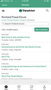
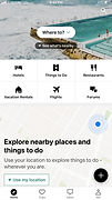
To ideate solutions that would help the user achieve his goals, I performed a competitive analysis to figure out if other products were addressing the user needs and, if so, how they were doing it.
Direct competitor


Strengths
-
Tagline communicates the value proposition.
-
Allows direct communication between users.
Weaknesses
-
Unnecessary entry-point friction.
-
Inconsistent UI design.
-
The user flow does not lead to finding information to travel like a local.
-
Does not allow to save relevant information shared by other users.
Indirect competitor


Strengths
-
A simple and intuitive interface, conducive to finding authentic information.
-
Secures authentic information from users.
-
Reduces friction at the entry point.
Weaknesses
-
No way to determine locals’ info vs. travelers’ info and no way to filter by locals’ recommendations.
-
No way to download information saved for offline use.
Design Ideation
Ideation methodoly

To ideate, I used the "I like, I wish, What if" method followed by a prioritization matrix to identify what ideas could potentially become features based on users' satisfaction and their viability/feasibility for PukkaTrip.

User flow diagram

With this tool, I defined and visualized the critical path that:
1.
Allowed users to browse through locals’ and travelers’ recommendations.
2.
Included a poll feature and poll response request.
3.
Provided reduced friction at entry-point.
Sketches
My focus was to:
1.
Introduce facets early on with descriptive words and icons: polls from travelers and locals, tips from locals, and categories within those.
2.
Respect users privacy by giving an alternative to location tracking and delaying ask to create an account.
3.
Allow a convenient way to organize information found on the app (save to a trip).
4.
Encourage users to support other travelers by answering their poll questions.
5.
Create one place where users can see and manage all the information they have saved or submitted.
Usability Testing: Round 1
I sought feedback on these initial sketches to test the user flow before moving onto higher fidelity wireframes.
Takeaways:
1.
Users were excited about the poll feature but thought it was hard to discover.
2.
Users felt overwhelmed by the number of filters shown and thought they took too much space on the screen.
3.
Users found that signing up with existent accounts, like Google or Facebook, was convenient.
4.
Users liked the prompt to create a trip to organize all information related to their destination.
Wireframes
Description:
1.
Included a link to Polls on the navigation and a pop-up message with a “Submit a Poll” CTA on the search results screen to improve feature discoverability.
2.
Kept icons and descriptive words for main facets and grouped others together under “More Filters” to declutter the search results page.
3.
Simplified the “respond to a poll question” flow and created option to change the poll question or to complete this step later.
4.
Revised Account page IA and layout to give users more control over their information and expose all app features.


Usability Testing: Round 2
The main goals for the second round of usability tests that I performed with 4 users were:
-
To evaluate if the app allowed users to find information about authentic local experiences.
-
To test the “respond to a poll question” flow.
-
To collect feedback regarding UI and visual design.
What worked well
-
Users were able to identify the app’s value proposition by looking at the first couple of screens.
-
Users were willing to respond to a poll question and thought it was a straightforward and easy step.
-
Users liked the ability to add information found on the app to a specific trip.
What needs improvement
-
Advanced users did not find the search functionality sophisticated enough.
-
Filters and the option to view poll responses on the search and account screens were hard to see and use.
-
Users wondered if creating an account was worth it.
User tasks:
-
Describe what the app is for.
-
Search a destination and apply filters.
-
Send a poll.
-
Respond to a fellow traveler’s poll.
-
Review received poll responses.
-
Add poll responses to a trip.
High Fidelity Prototype
Based on users' feedback, I defined some iteration goals and revised interactive prototype.
Iteration goals:
-
Preserve critical path since it was successful in helping users accomplish their goals.
-
Improve visual design to address usability and discoverability issues by getting rid of small font sizes and increasing button color contrast.
-
Add trip features aimed to increase efficiency for advanced users.
-
Revise language around the need to create an account.
Next Steps & KPI's
Next Steps
-
Test critical path with a larger number of users with similar goals of those of the user persona.
-
Give users the option to apply filters before they search so they are directed to more relevant information as soon as possible.
-
Design alternative user paths that could result in increased conversion; for example, by designing a path to save relevant information on a trip without submitting a poll.
Key Performance Indicators
-
A decrease in user’s time spent finding information about activities that locals do at their destinations.
-
Increased user’s confidence in their ability to find an authentic and unique experience when using the app.
-
Increased user satisfaction with experiences enjoyed during their trip.
-
Growth in size of user/traveler community connected by the app.
-
User’s sustained engagement and contribution to the app via poll responses and tips.


